


Entering an exciting, new phase of product and industry leadership, Activu was eager to promote a new software release on their website. We developed new, succinct, energetic messaging, and completely rebuilt the focus of the company branding to focus on Activu’s core competencies and trustworthy record of solving big problems for their clients.
Messaging was streamlined, placing customer stories at the forefront of the discussion, highlighting benefits Activu delivers through their solutions. Product messaging was overhauled to enhance readability and market differentiation in Activu’s solution compared to the industry.


Predata asked for a brand refresh, starting with the website. I changed the brand accent color to a bright aqua, and settled on a palette of mostly slates and midnights, with a few secondary colors as needed. A tremendous amount of forethought and WordPress customization effort has been expended to make the site very easily administrable for non-developers from the WP admin area, without using clunky WYSIWYG admin overlay plugins. The result is a very functionally complex site, fully custom CSS, numerous automated features, and a very friendly dynamically-populated Bootstrap-based carousel on the homepage. See the site here: predata.com


Photos, web gallery, and an email campaign for TechStyle NYC’s holiday gift guide.


Brand development, marketing campaign execution, email design/dev, materials and website development. Link


Photography for Ultimate Cuff, working with models, The Wanderlust Girls.


Photos of interiors and a few patterns at the historic Friars’ Club in NYC.


Website design for a care package service.


A landing page and lead collection microsite for a Baddish Group event promoting Cutty Sark.


Website and web application development for this large, global financial risk and ratings agency. Link


Coordinated and executed transfer of over 6500 posts from Hubspot to a new WordPress website by hand, setup new WordPress site per client flat template, managing content tech for automated daily content marketing and email campaigns, producing art/design as needed per client guidelines.


Branding and collateral design for FNA.


Branding, website, and other collateral for Athos Risk, a financial information and services firm.


Branded identity and materials for a new internal initiative at ADT. Some of these were used ultimately, some were not.


Full brand, message development, and all integrated marketing materials for this ecommerce startup.


Developed concepts for a marketing and messaging campaign to encourage the US population to get the flu vaccine.


Exploring how to use the 50+ year old brand to revive it and build messaging around the product while reintroducing it.


Branding and some collateral for this small local cookie baker and caterer.


Rebranded MSCI after the RiskMetrics Group acquisition. While some aspects of the MSCI brand were outside the scope of the project (logo, and other elements), it was important to knit the many newly joined brands together into a cohesive framework that fit into the existing brand architecture.


Mood Book is an extremely oversized book of microphotos. Most objects in this book are smaller than a quarter, some the size of a grain of rice. But in this presentation, they become far larger and closer than the viewer has ever experienced, transforming the viewer into the tiny thing exploring a new alien landscape previously out of reach.


Branded a new identity and renamed this IT consulting firm after a 2-day creative workshop with the client. We focused on ideas of connection and how to set the firm apart from competitors.
The back of a server stack, with its legions of wires and cabling, like tentacles of a squid or jellyfish, inspired the visual language, and even the creation of a fun mascot we named “itsy.”
We explored all the uses of I.T. and how to reframe the role of I.T. as more than just pulling cables. With I.T., people Innovate Together, and Instill Trust in an Information Topography, across an Intelligent Tapestry.
These playful explorations found their way into the visual expression of the brand, and With I.T. became the new name of the company. We’d not entered into the workshop intent to change the company name, but the client trusted the process, and we arrived at a unique result.


Macro and microphotos of taco ingredients promoting the Taco Truck’s new store opening.


PieLab was a backwards business, an outgrowth of the Free Pie! event I co-created with a team of young designers, while at the Project M workshop in Belfast, Maine.
PieLab’s goal was to bring together one of the poorest communities in America, and provide job opportunities, through affordable, delicious, homemade pie. We collaborated with a local aid organization to extend the reach of our efforts, and the restaurant opened to rave reviews in the New York Times, Bon Apetit, and Southern Living. The restaurant space, a repurposed storefront, was nominated for a James Beard award in restaurant design, and the store was named one of the ten best places to eat pie by Bon Apetit magazine.
Locals came to the restaurant to eat good pie, and some came to make their own family recipes for the customers. With the space functioning as a social hub for the community, there were music events and entrepreneurial initiatives, like the one that helped a local group of kids launch their pecan brittle business out of PieLab’s kitchen.


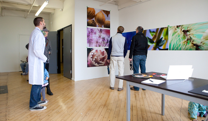
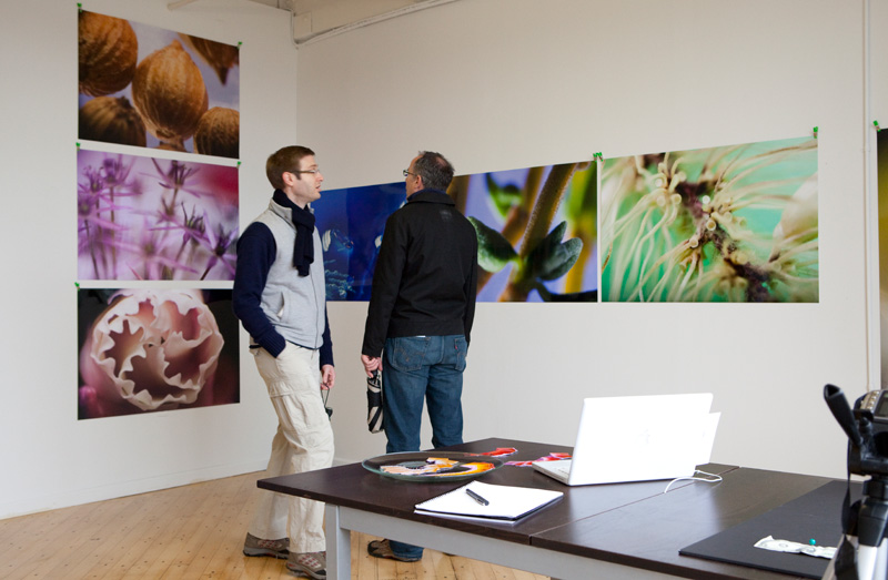
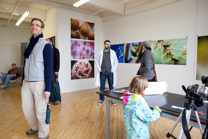
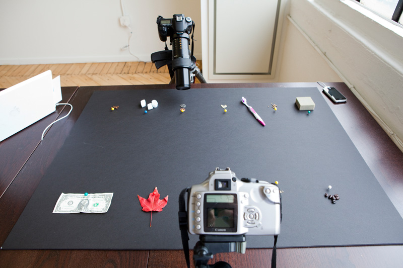
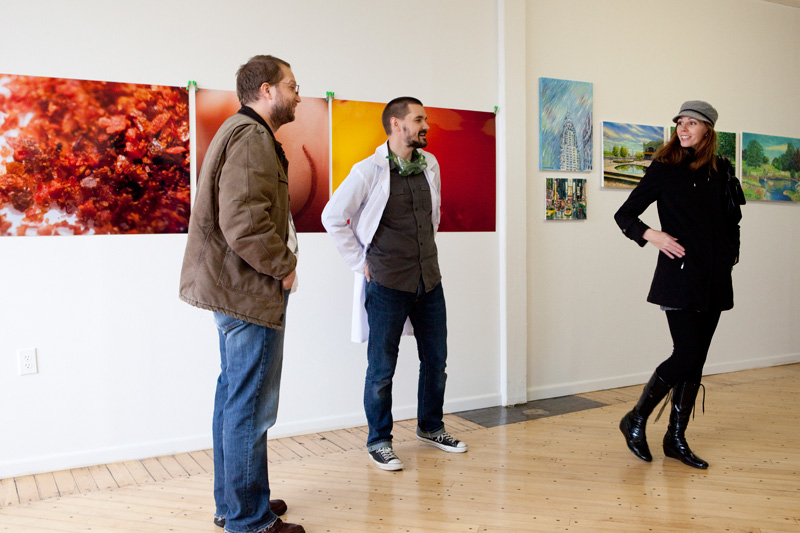
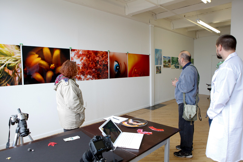
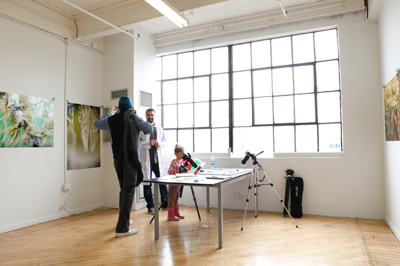
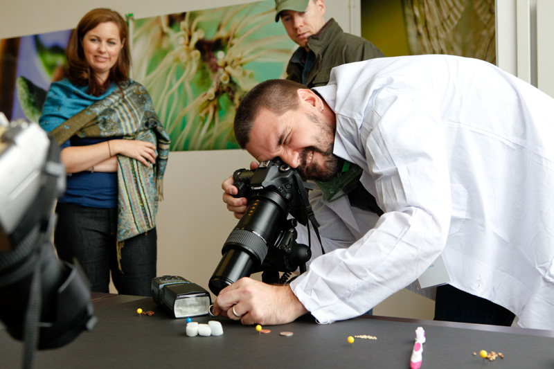
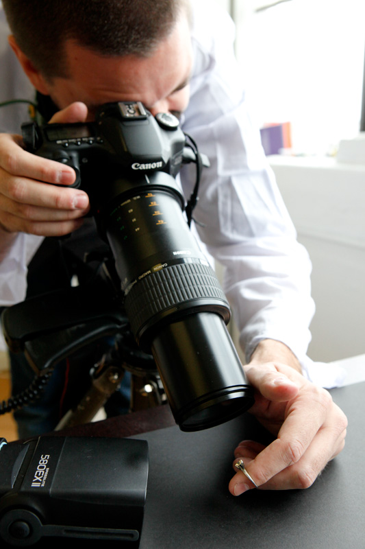
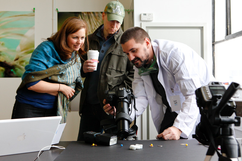
Tiny Lab opened as part of the Hoboken Artists’ Studio Tour group show, October 2009. In the exhibit, I showed microphotos of ordinary things, 13 large macro- and micro-photos, output on archival Fujichrome photo paper at 30×45″. I also setup two cameras fitted with high-powered lenses and a variety of small everyday objects for visitors to explore in exactly the same way I create my art. I photographed small personal objects for visitors and sent them the resulting macro- and micro-photos after the show. Kids & adults were fascinated by the magical transformation of their everyday objects into art before their eyes. Objects shot at the show included an old cough drop, jewelry, a half-eaten twizzler, a dollar, some coins, and other mundane objects.
Most objects represented in this show’s artworks are smaller than a quarter, some the size of a grain of rice. But in this presentation, they become far larger and closer than the viewer has ever experienced, transforming the viewer into the tiny thing exploring a new alien landscape previously out of reach.

Creative direction of all RiskMetrics branding and materials, management of all marketing programs. Integration of 3+ brands through acquisitions. Messaging development for umbrella brand and product materials and marketing. Management of events and marketing outreach.


