Predata asked for a brand refresh, starting with the website. I changed the brand accent color to a bright aqua, and settled on a palette of mostly slates and midnights, with a few secondary colors as needed. A tremendous amount of forethought and WordPress customization effort has been expended to make the site very easily administrable for non-developers from the WP admin area, without using clunky WYSIWYG admin overlay plugins. The result is a very functionally complex site, fully custom CSS, numerous automated features, and a very friendly dynamically-populated Bootstrap-based carousel on the homepage. See the site here: predata.com
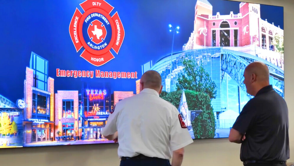
First responders are busy people. Whenever I have the opportunity to shoot a case study video featuring first responders, I’m meticulously focused on the efficiency of their time investment. Our subjects are always generous with their time, when they are available, but I don’t want to take too much advantage of that.
People outside of creative professions are often surprised how much time, effort, equipment, camera-time, and reshoots are required to supply a video project with quality content, appropriate for a professional result. My job as writer/director in a case study shoot is to ensure we capture more than what’s needed, while managing the subjects. This often means I coach them through the on-camera interview, which is frequently uncomfortable for people not accustomed to the camera. Folks rarely like being stared at by the camera’s eye while being put on the spot to answer. We stick to the things they know best. We don’t feed them lines, we just have a conversation, hopefully engaging enough that the camera and lights disappear and they can relax.
Sometimes, in order to respect the subjects’ time and our shooting schedule, we need to interview off-camera, or simply record a conversation. Flexibility is key to fitting a shoot into the regular day of a high-stress environment.
Apple Computer Award for Best Campus Store Branding & Marketing
2016 – Awarded to Rutgers Housing Department from Apple, for my work creating and executing the branding of the new Rutgers student tech store, Kite+Key.
James Beard Award for Restaurant Design (nominated)
2010 – PieLab (a Project M collaboration I worked on, and was on founding team) nominated for James Beard award for Restaurant Design 2010.
PBS National Development Award
1999 – Awarded for my work on the WETA (Washington DC PBS) fundraising event, Fete-a-Tete, branding and invitation design.
IABC Silver Inkwell Award
1999 – Awarded for my work on the WETA (Washington DC PBS) fundraising event, Fete-a-Tete, branding and invitation design.
Association of Government Accountants Award of Excellence
2000 – Awarded to the National Science Foundation for the annual report I designed for the organization.
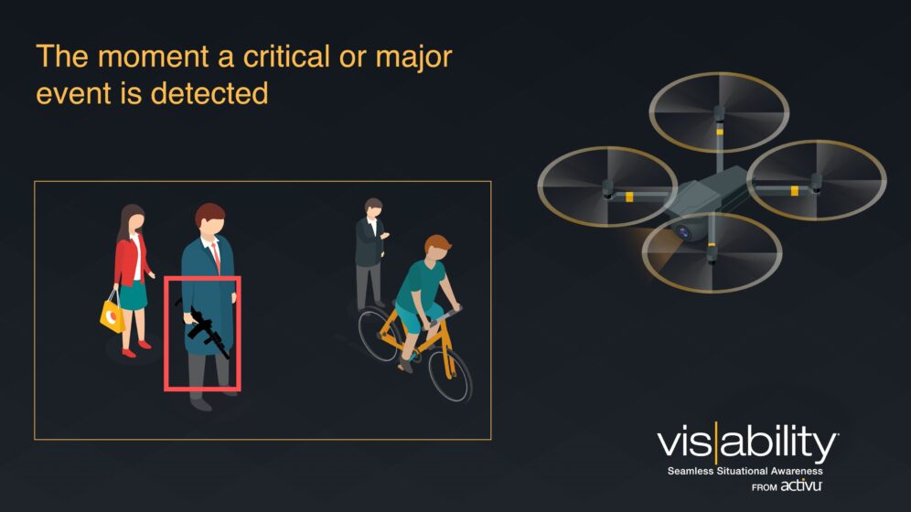
This quick little video was my first serious foray into professional motion graphics and animation. We needed it to very simply convey one big value proposition (automation of information), along with several benefits to the proposed solution (gun detection integration, easy access to video any feeds, sharing to any device, collaboration). This was created in Adobe After Effects and Premiere Pro.
This little video needed to be flexibly used as either a standalone demonstration and how-it-works to prospective customers, or a video loop on-screen at tradeshows and events.
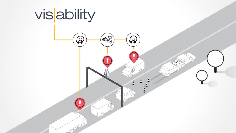
I wrote and creative directed a series of videos, intended to tell the same story about a software platform to three distinct, different audiences: traffic managers, first responders, and IT managers. These audiences all share common generic needs when coordinating and communicating critical information with their teams, but the tools they depend on and the situations which they are managing vary. This required a flexible script that could tell their story, while the visuals carried the specific use case. Working with an agency, we animated three videos which reused about 75% of the animation, and 100% of the voiceover narration, helping to manage project cost.
In a corporate case study, I always want to find the thread that unites the story. A case study HAS to be a story that viewers can connect to, not just because the technology or product is relevant to them.
The people in the story, users of the solution, need to feel real and convey realness through their challenges and approach to solving them. The product’s role in that solution gains importance through association with that resolution. It fits perfectly with the thing our main characters were looking to solve. The viewer identifies with the story because they see these same challenges in their own work.
It can be challenging to distill a rather technical and wonkish business to something that most people can grasp. Businesses that deal with data and analytics can be especially tough in this way. In this case study, I wanted to ensure that the viewer could connect the firm’s value proposition to something they can relate to in their everyday life, since it wasn’t meant only for target customers in a tightly defined niche.
Additionally, this video was produced as a partnership where both organizations gained promotional value from the piece, so we balanced the messaging accordingly.
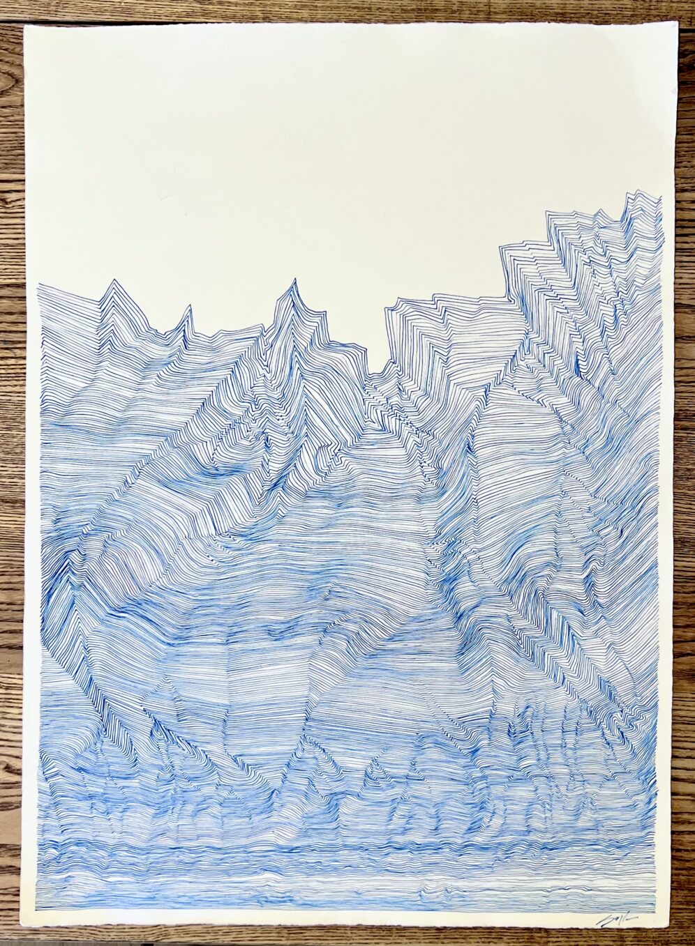
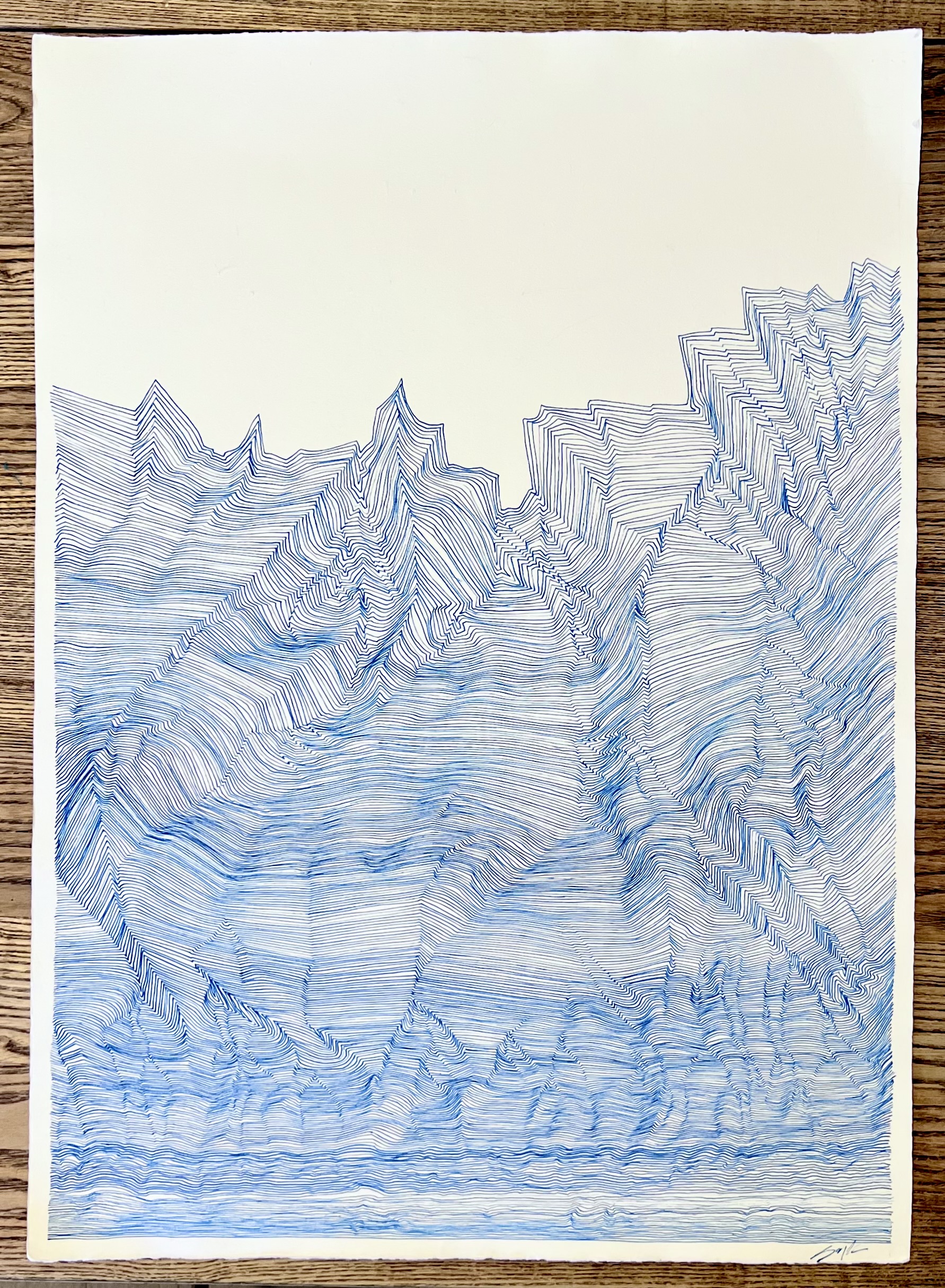
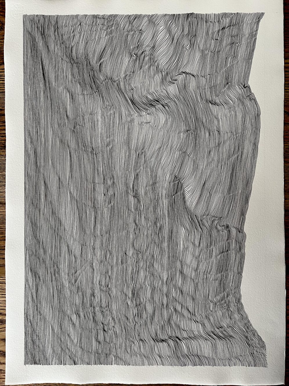
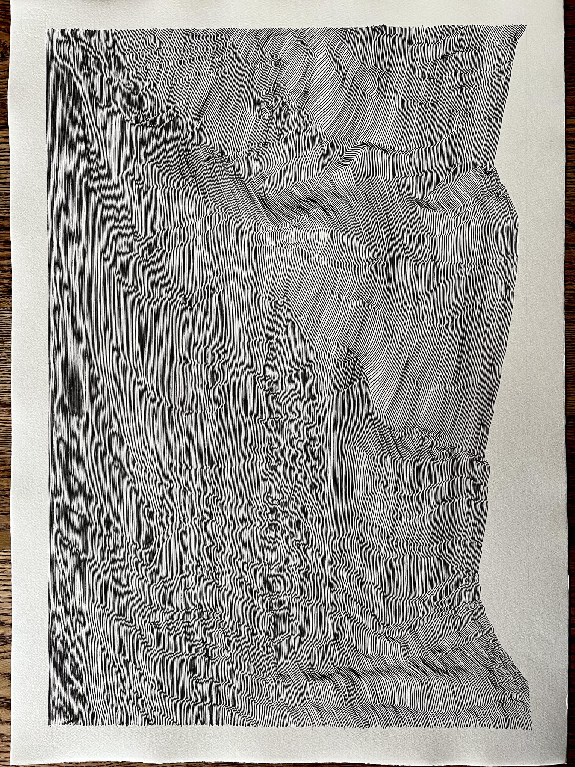
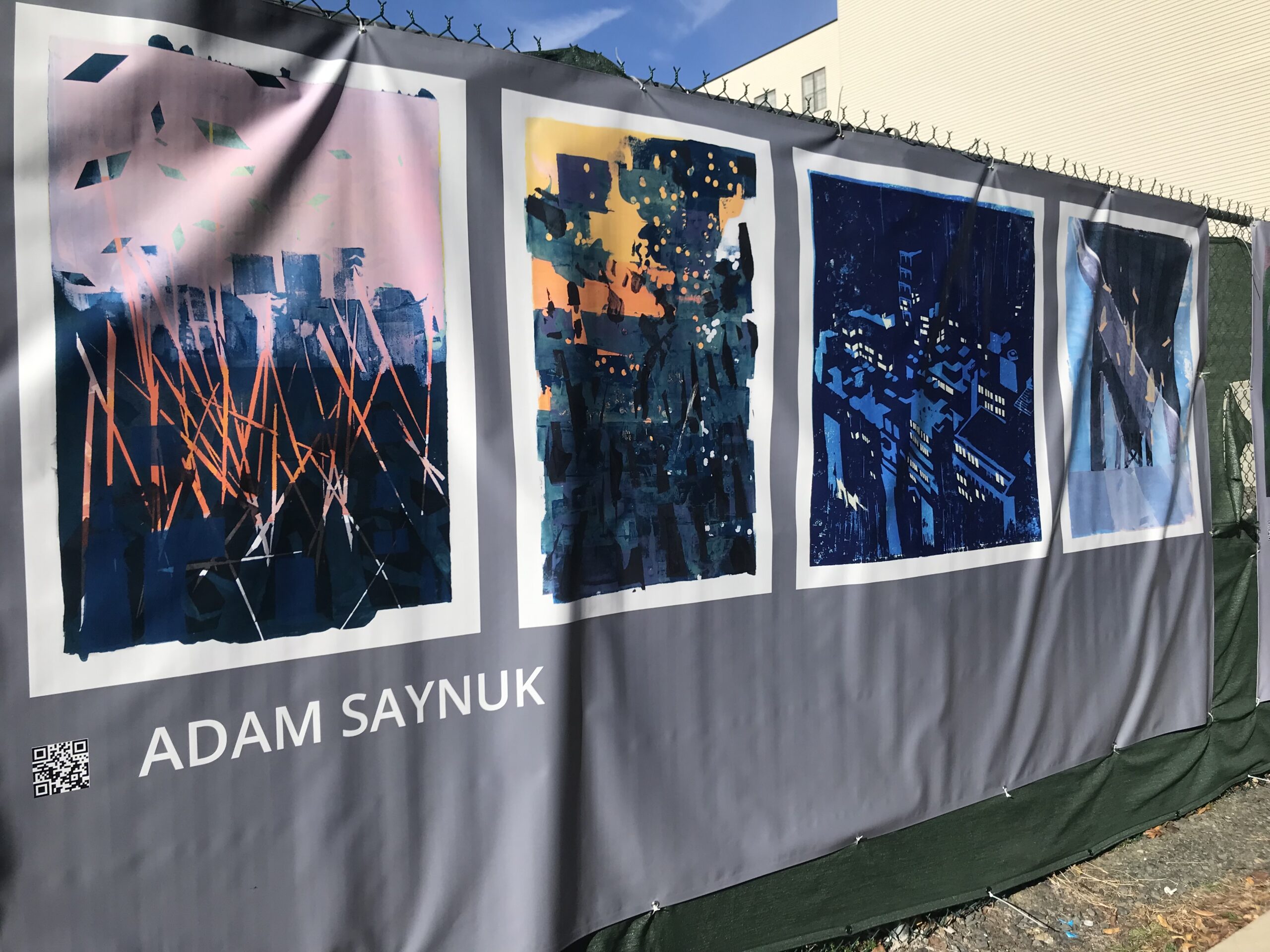
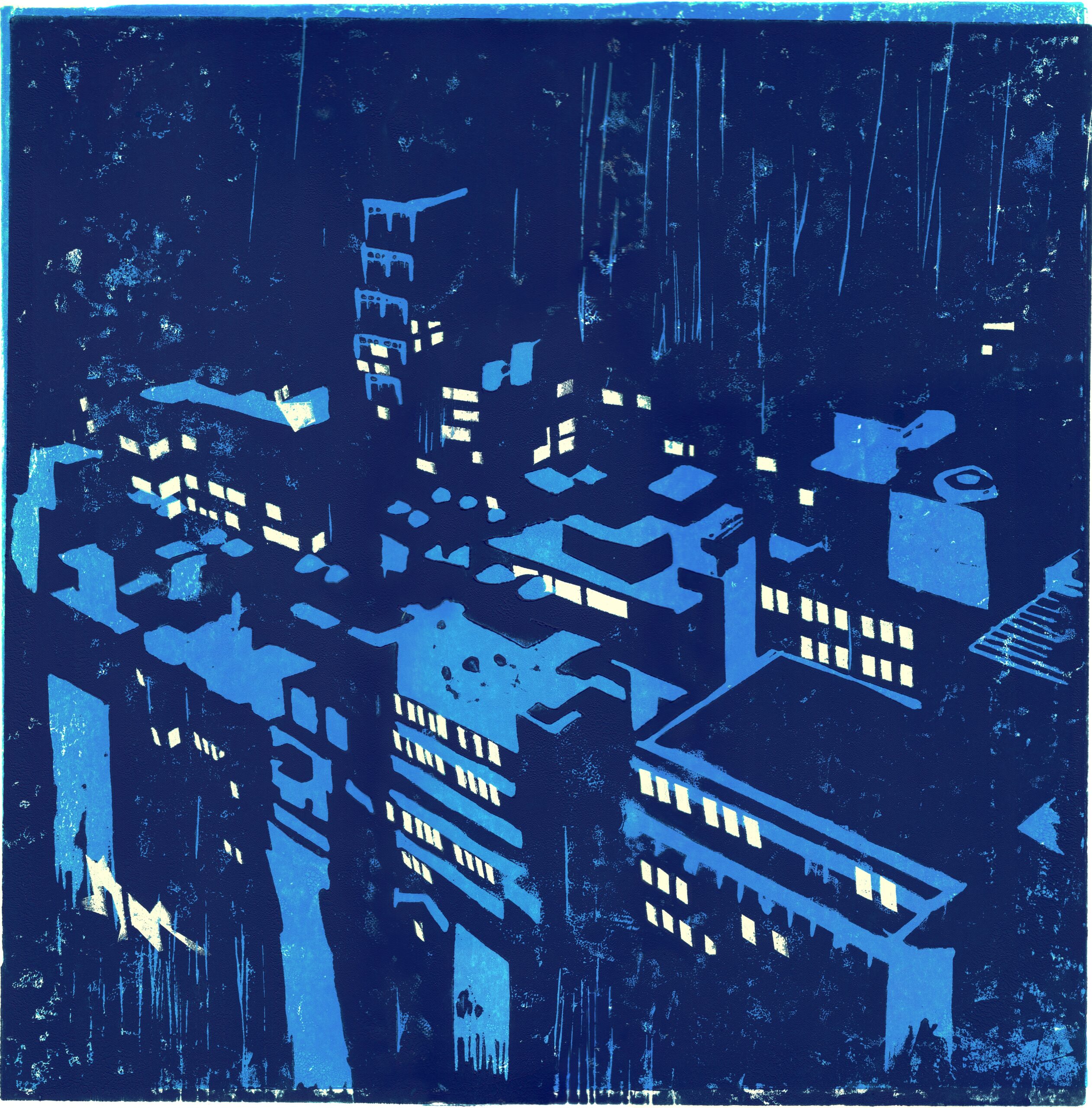
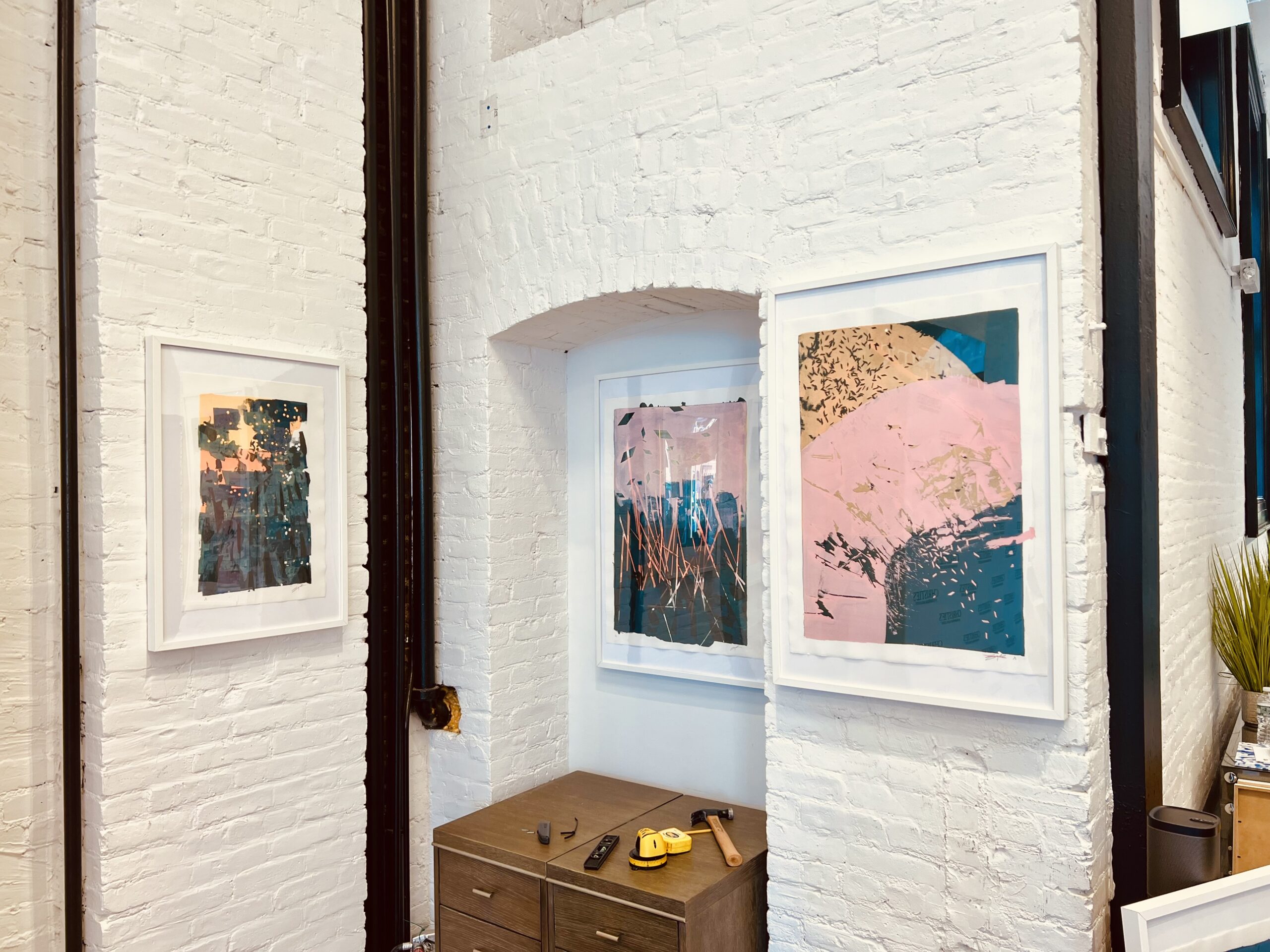
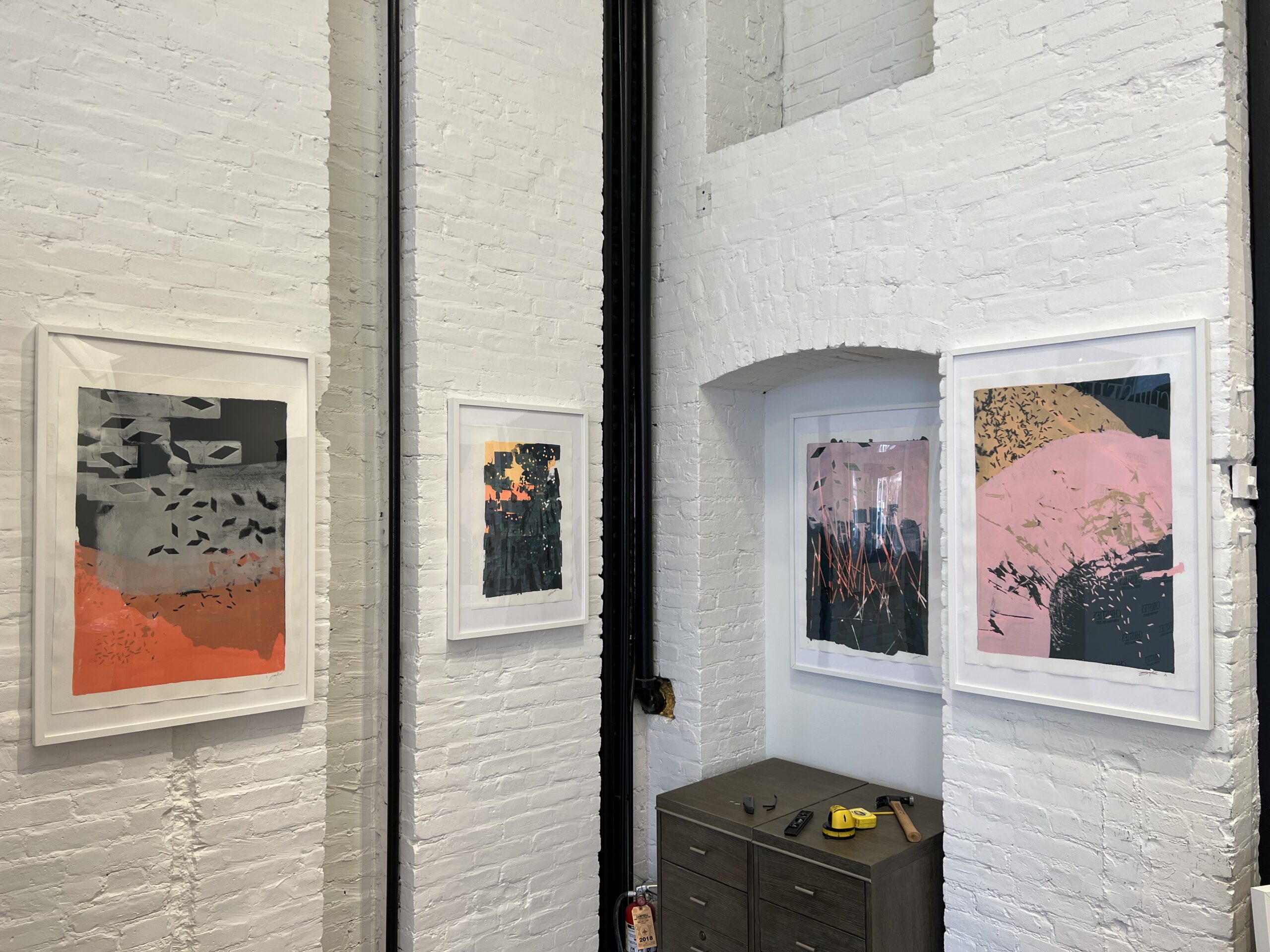
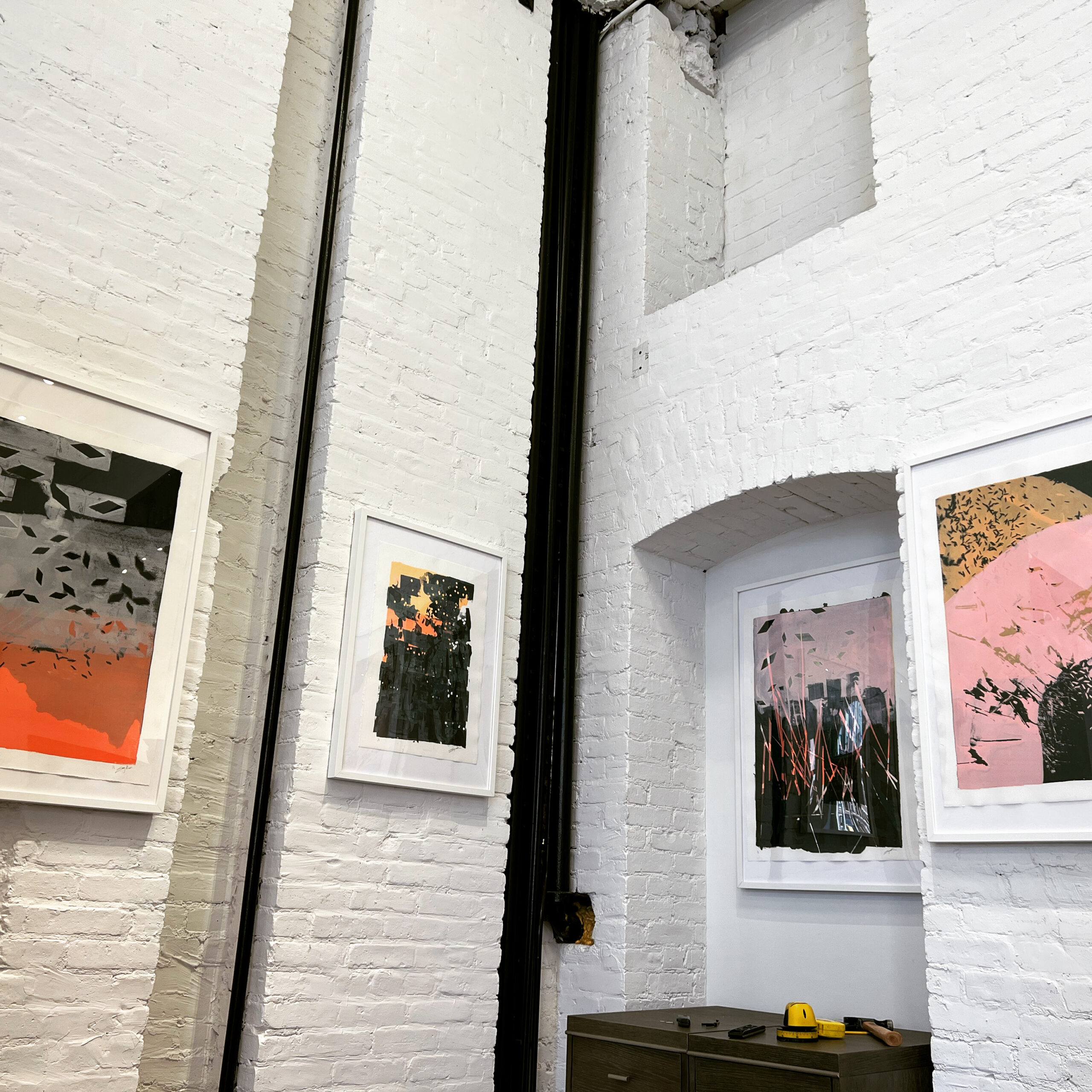
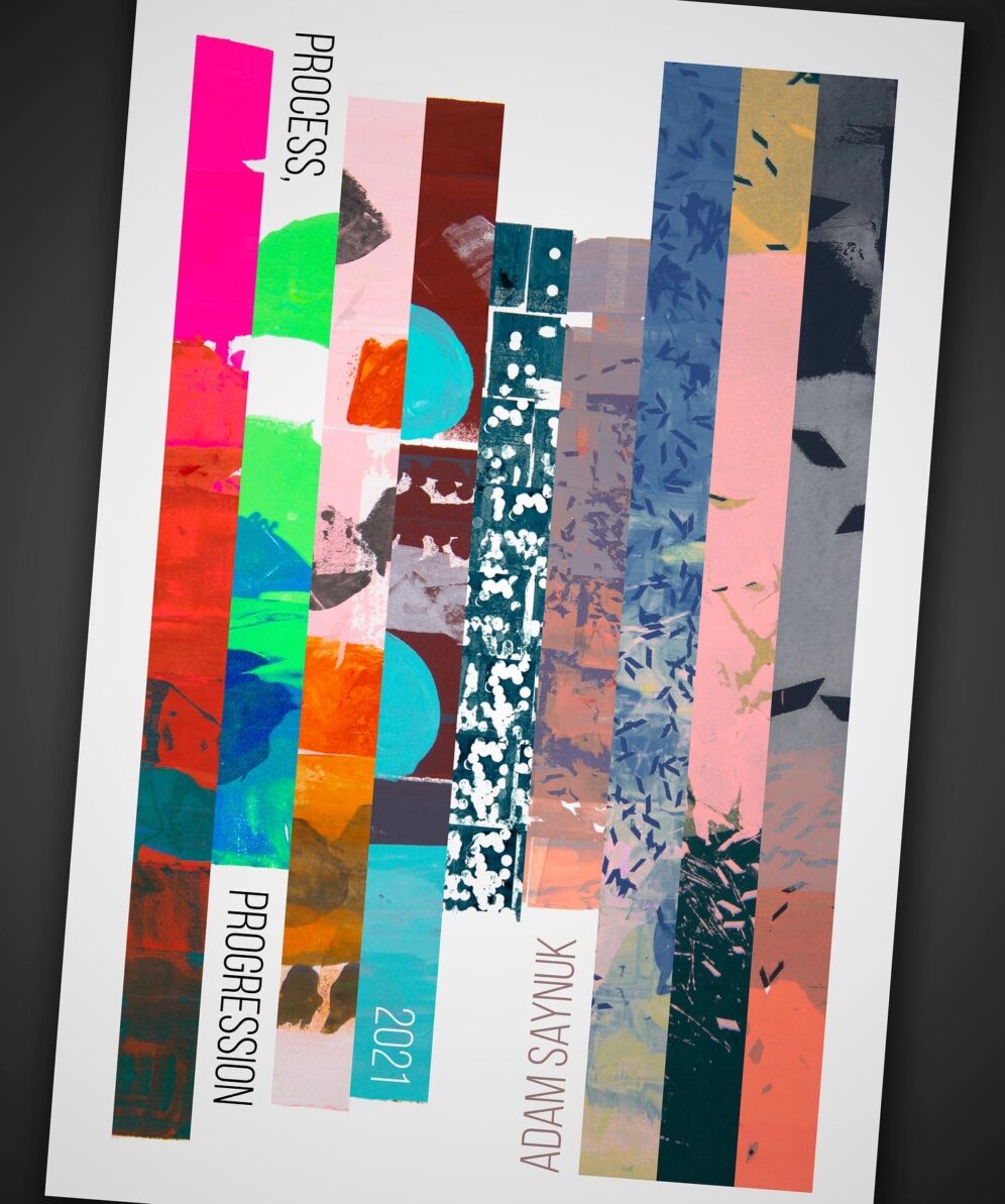
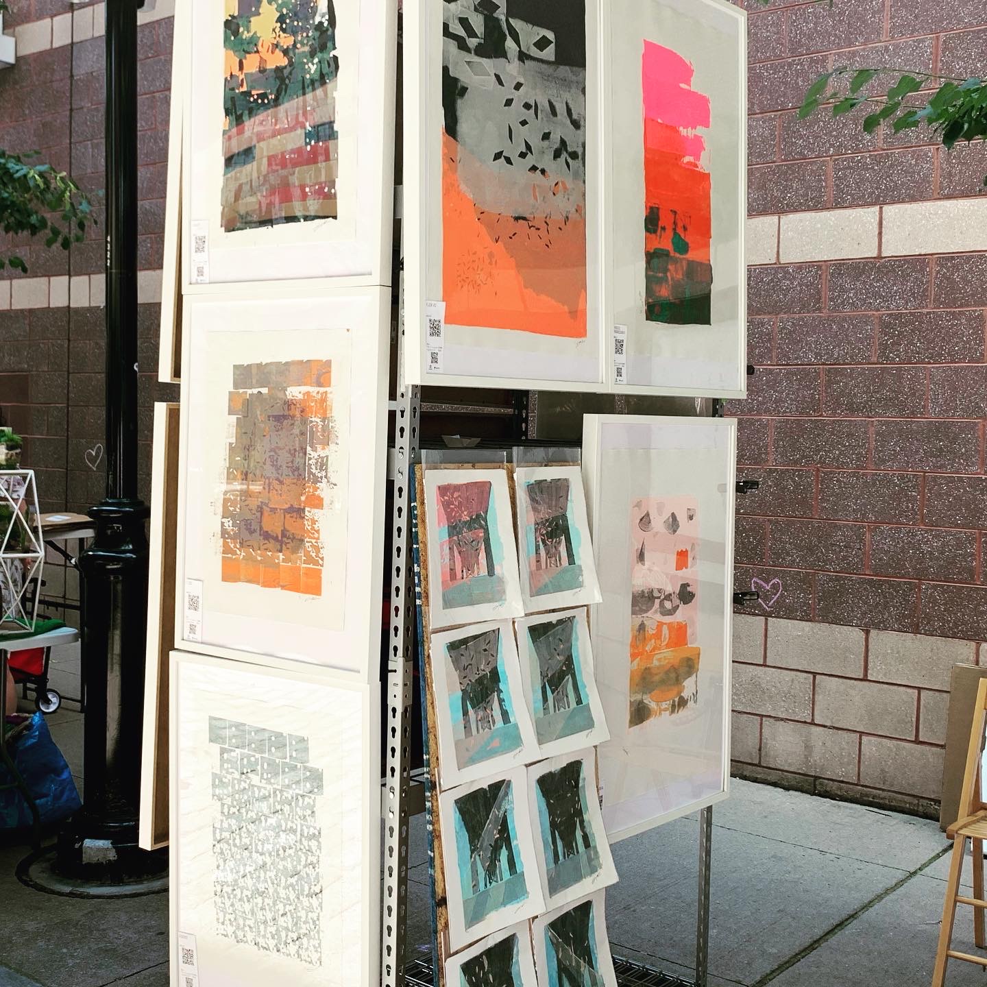
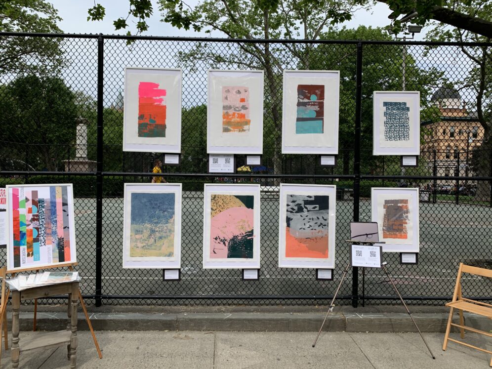
The Process, Progression series grew from that exploratory mindset. Embracing the natural mess and variability of material, along with my own technical limitations, has allowed me to really enjoy the process and the results of my experiments. And I’ve found a meaning inside the works here… to me they are about memory.
I’ve thought a lot about memory and time lately; aging and growth and change and decay. And to me, the Process, Progression series offers an expression of how memory is captured, how each memory affects the interpretation of the next memories and the ones before it. In these screenpaintings, the screen imprints details of previous printings, inks, squeegee strokes, stencils. By using a static tool in place of a paintbrush, the memory of previous work literally imprints itself into the newer ones, whether it was from minutes ago or months and years. The screen remembers.
These are abstract works. However, the seeds of ideas imprint themselves regardless. I’m never aiming to duplicate a flock of birds or petals or insects. But I think the feeling of these things and their place in space can be transferred by thinking about the feeling they evoke, while working on a piece. Swarm is not bugs. But it’s the feeling of buzzing insects and scratchy grass on a humid summer day. Maybe the Flock pieces feel the way that birds in beautiful skies feel to us. And maybe that’s how memory works, more than any perfectly captured reproduction.
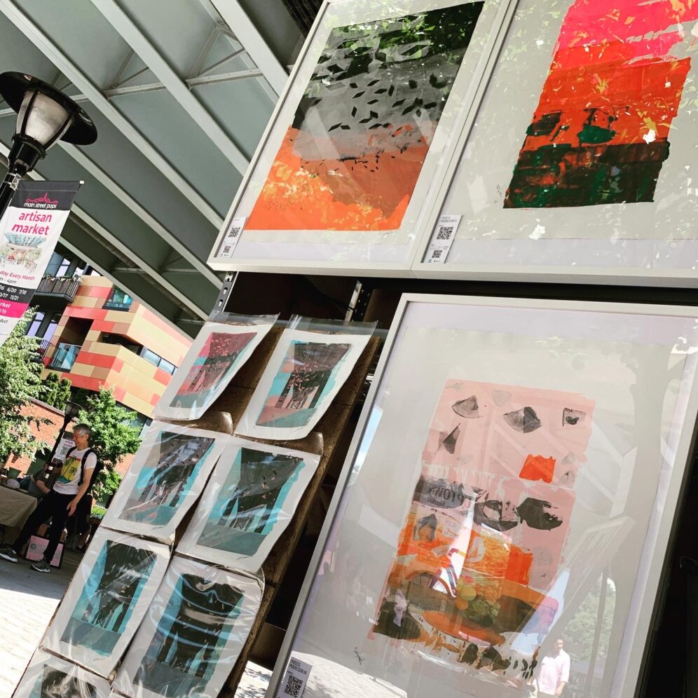
An exhibit and art sale in Hoboken, displaying work from my recent Process, Progression series in the iconic market under the 14th Street viaduct. I made a series of mono prints inspired by the setting under the bridge, for sale at the exhibit. Each in the series is unique, and connected as a series of frames that track the movement of the sun through the day, glinting the wings of birds, during the show.
This feeling is the one where we are in a wild or semi-wild natural respite amongst an urban backdrop. Reeds, grasses, or cattails create their own swishy crowds in the space, maybe the ground is wet or muddy, and smells earthy and cool. Maybe a stream trickles nearby, hidden by the surrounding growth.
For me, one of the themes of this series has been around memory, a theme inspired by the “memory” each screen brings to the next piece from the last. Because of my janky washup and generally improper use of screen printing tools, we can often see artifacts of edges or colors from previous prints, embedded into the designs of later experiments. And I’ve come to think of these experiments as representations how memory works… maybe it’s not a perfectly clear picture of the thing we recall, but rather we remember the feeling of the thing first, and our imagination fills in the visual and other senses.
An exhibit and art sale in Hoboken, displaying work from my recent Process, Progression series. In addition, I made a series of mono prints inspired by the setting outdoors in a park, for sale at the exhibit. Each in the series is unique, and connected as a series of frames that track the movement of the sun through the day, during the show.
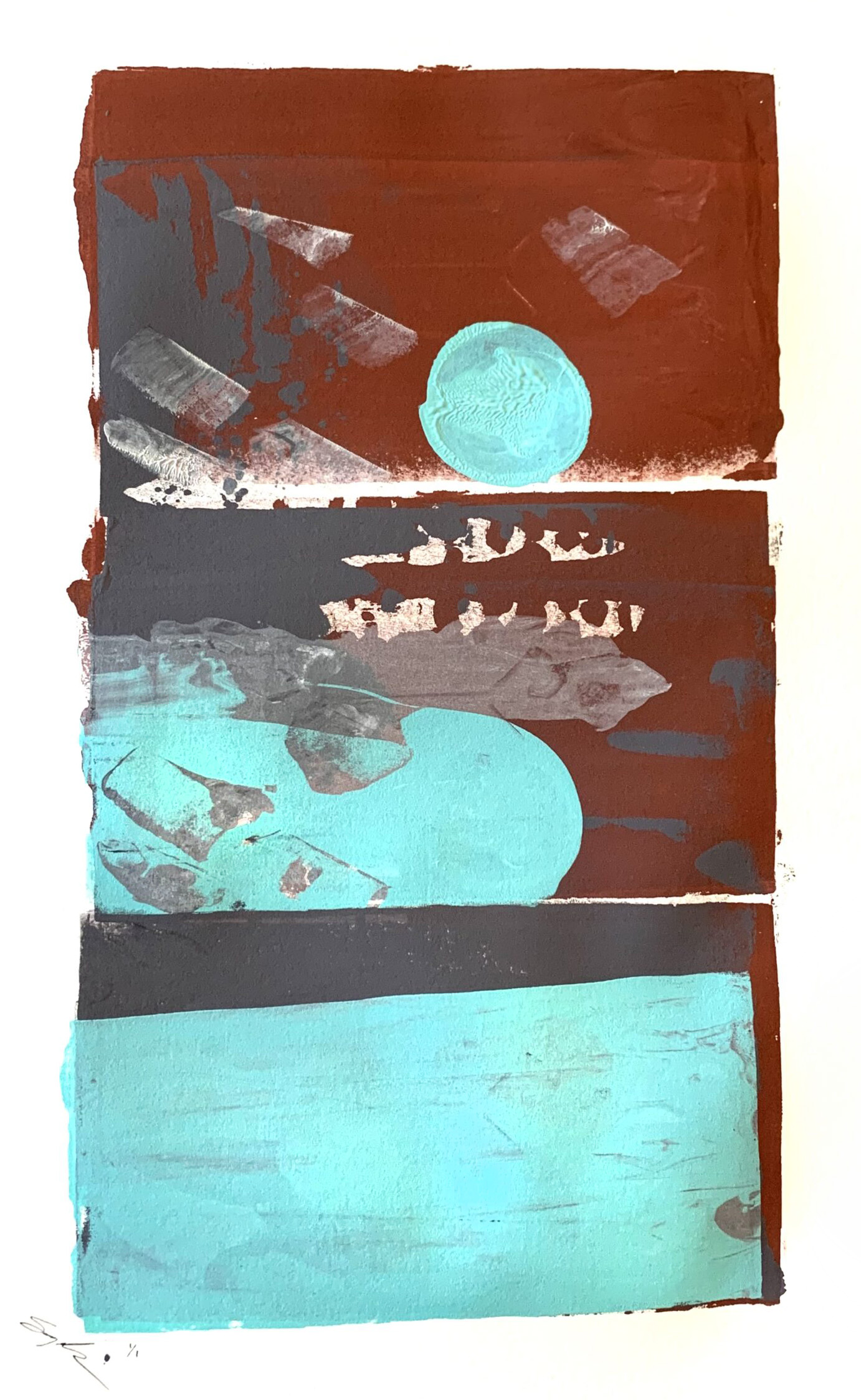
In this experiment, we are looking at more use of translucent white—the mix is almost all medium—and translucent coral on a dark slate backing. Also, we’re seeing the parallelograms change size to bring a new sense of space to the piece.
Swarm: In this screenpainting, latest in the Process, Progression series of experiments, we see the parallelogram stencils again, in positive and negative this time. Also, pine needles were introduced in this experiment, as stencils. I wasn’t quite sure how they would look, since they’re very dimensional compared to paper stencils.
I was thinking of insects coming out of shadow in grass or a mound, maybe it’s under an overpass. But you are welcome to see whatever you want in it. It’s abstract!
This piece—part of the Process, Progression experiment group—was made with a larger screen, and diverges from the previous Flock experiment. Here, we did NOT step-and-repeat throughout the work as before, hoping to avoid the wet ink transfer and ghosting so prevalent in the previous step and repeat pieces, while also hoping to avoid all those little parallelograms sticking in the wet ink and having to be picked out after squeegeeing. The progression was instead accomplished by squeegeeing 2×2” sections in alternating directions with randomly applied ink colors over one contiguous large screen, resulting in a small amount of tiling pattern. . Well, we avoided the messiness of the step-and-repeat, but like a thousand of those little bits stuck in the ink and had to be picked out by hand one by one with an exacto blade. I’m very thankful my super-encouraging and enthusiastic and sweet and helpful studio assistant @violet.anne_ , who participated and offered ideas throughout the creation of this one, and jumped right in to help with this tedious concluding task. . More experiments to come.
This piece is accomplished by taking another step in the Process, Progression series. Again, we are relying on random organic ink flows inside a screen, with some form-constraints, in this case a small circle and a 2-inch square field. To introduce randomness (aside from my janky carefree application of the screen print), we sprinkle paper dot cutouts, castoffs from the hole punch tool. Each successive swipe of the small 2-inch screen picks up more of them because the ink is tacky, creating its own random stencil through the successive printing operation. Screenpaint strokes were applied in a snaking pattern starting top left, moving right 5 steps, down a step, moving left 5 steps, down a step, and so on. . A fun effect of this process is that when you step back and squint at the whole piece, it looks sort of like a messy inverted halftone gradient, which is what you might see if you look at a picture in a printed newspaper with a magnifying glass. But ours was made through a planned random process. . It’s fun to have so many frames that create this piece, that we can stack them into an animation and watch the individual strokes and stencils change through the run. I shot each one and created a video from the combination.
Made with similar process as before, watching how inks progress and move as we add elements and colors and moves down the surface. More color palette experimentation. I was going to have a more muted accent but chose to go bolder.
A more subtle colorway, from a friend’s suggestion.
I flooded with the backing color and ran it out in successive swipes; used different tools for new shape experiments and ink medium for high translucency black; then squeegeed the whole mess, running that out to the bottom. For this piece, I was thinking of birds in a low fog and low sun.
I wondered what would happen if I squeegee in half circles, dropping inks into the screen randomly. Both these prints used the same technique and colors, but the look of the second one is affected by the action in the first. In the same way that screen prints I did with a stencil years ago in this screen still show up as ghosts sometimes in new prints. It’s cool to see one piece echo in the next one, whether screenpainted immediately after, of years later. It introduces ideas of memory and permanence/impermanence. And I like making the choice to accept the nature of the medium with its irregularities.
These screenpainting experiments are the messy pinhole-camera side of screen-printing’s photo-exact pursuit of perfection. Please note that the image of Process, Progression #4 is a temporary, non-adjusted photo of the piece, and it’s color clarity and saturation in reality is the same as #3.
Process Progression #1 & 2: Unstenciled screenpainting experiments. Trying to use the screen as a paintbrush, and allowing ink colors to mix in the screen well and in the squeegee. Each of these are 1 of 1. Please note that the image of Process, Progression #2 is a temporary, non-adjusted photo of the piece, and it’s color clarity and saturation in reality is the same as #1.
WealthEngine wanted to inject new energy into their brand, and build out some infographics that clarify and simplify their value proposition. Working with the Art Director, I explored documents, conference display materials, infographics, and more. I worked with the client to establish the standards in guidance documents, so they could continue to build their materials using the in-house team.
WATERVANES: Art in nature, one day only, Willowemoc River, Catskills, NY, 2019. All pieces are found objects and pigments in the river, held vertical by friction and gravity.
I approached this corporate case study video as a documentary, rather than a technology business’s promotional piece. I produced the piece, assisted on-site capturing content, interviewed our subjects, and directed the creative execution.
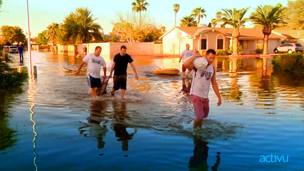
Entering an exciting, new phase of product and industry leadership, Activu was eager to promote a new software release on their website. We developed new, succinct, energetic messaging, and completely rebuilt the focus of the company branding to focus on Activu’s core competencies and trustworthy record of solving big problems for their clients.
Messaging was streamlined, placing customer stories at the forefront of the discussion, highlighting benefits Activu delivers through their solutions. Product messaging was overhauled to enhance readability and market differentiation in Activu’s solution compared to the industry.
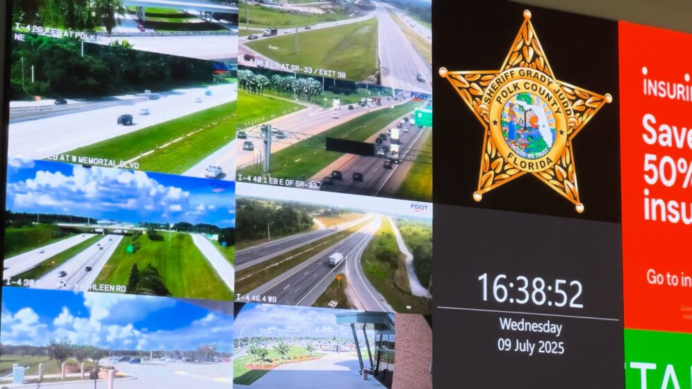
Activu is the market leader, and early industry innovator in the installation and management of video walls and software. Activu solutions are deployed in some of the most critically-important corporate, military, security, and transportation agencies globally.
Appzen wanted help sharpening the details and call to action for some of their online product information. I worked through wireframes and content development to clarify an engaging pitch that focuses visitors on product benefits and moves them to convert.
SelectMinds needed an infographic to combine HR tech information with talking points about their HR platform. This was used to generate press for the firm in the lead-up to their acquisition by Oracle.
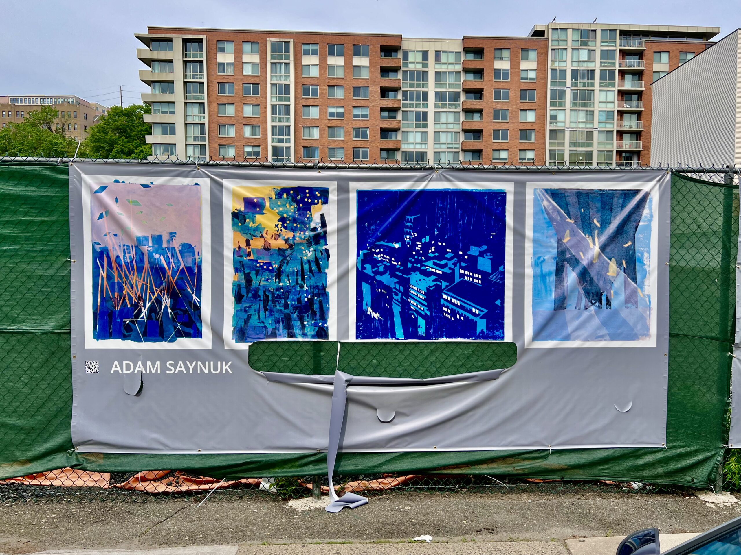
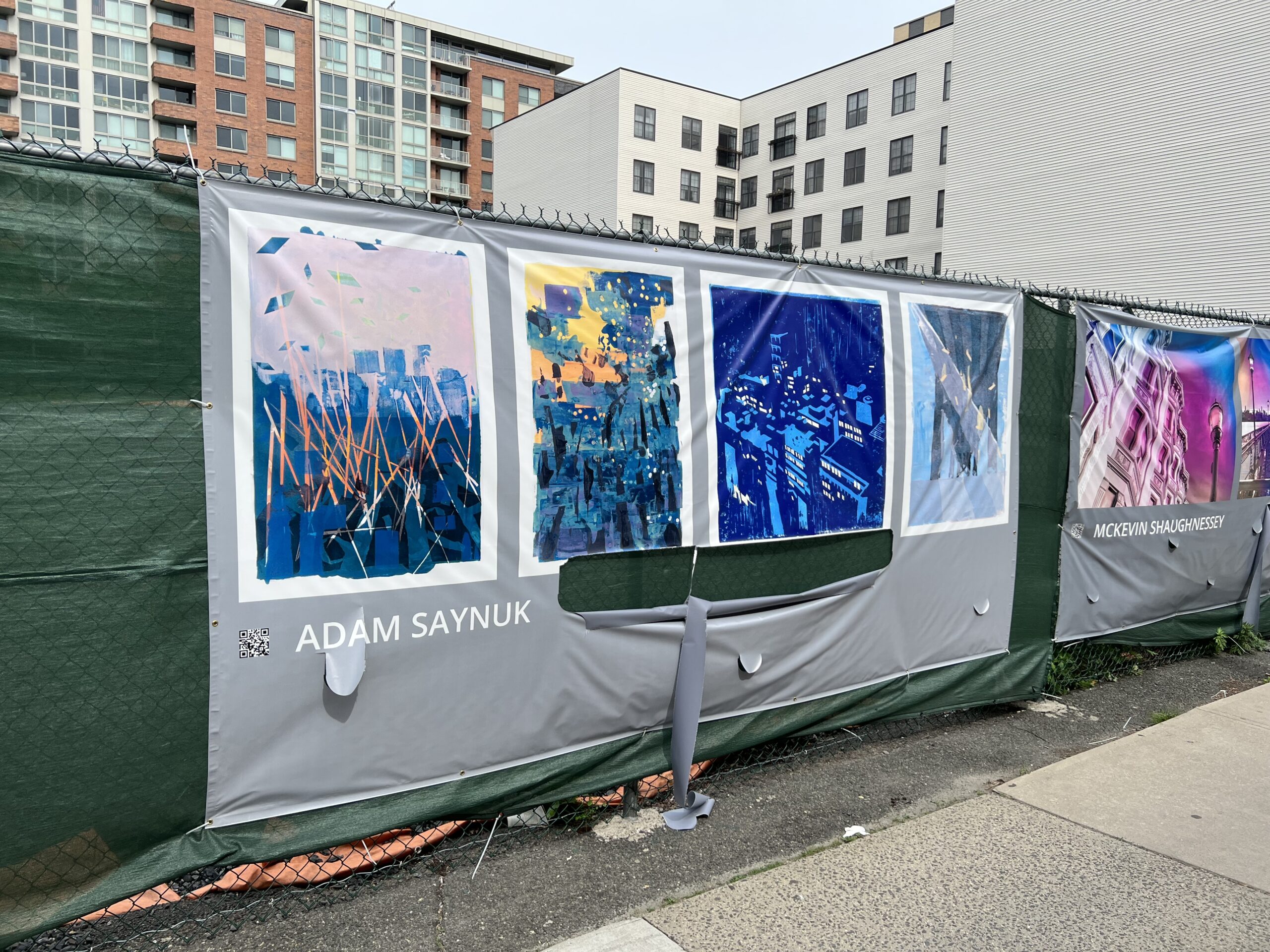
BAKERY is a creative studio, founded by Adam Saynuk. Bakery develops brands, integrated marketing, and websites for small and global B2B and B2C companies.
Caffe Unimatic is a unique brand and percolating coffee maker with a touching back-story that touches on themes of family, timelessness, and connection with a fulfilling experience.
Teaching 7-8th grade children about design through a hands-on, workshop-style class. In one of our self-generated projects, we reimagined Hoboken’s dreadfully confusing parking signs as more friendly and legible communication devices.
We began by choosing to project mainly positive messages for people looking to park their cars. The class acknowledged how challenging it is for their parents and visitors to drive safely down Hoboken’s narrow streets—watching for pedestrians, cars pulling out, doors opening into the lane. We determined that an icon-based approach was necessary to help parkers in their first stage: “can I park here or not?” We changed the sign’s shape to improve non-legible communication using universal icons: the well-known public parking “P” in a blue circle, and a “house” shape.
Even a non-resident would notice and understand the parking “P” and feel confidence approaching that side of the street for a parking spot. Placing the word “visitors” directly below the “P” reinforces for non-residents that they may look for those signs to park. Conversely, the house-shaped sign uses the word “resident” at the very top, which, combined with the the shape of the sign communicates to visitors that these are not visitor parking spots. All this new information is easily conveyed to a driver, quickly and safely, without squinting or taking their eyes off the road for much more than an instant.
Once drivers understand this information, the signs clearly convey to visitors that they are only welcome to 4 hours of parking, and permit holders are welcome as long as they like. We then used a bright, contrasting color to separate the street cleaning times and dates, and designed them as a viewer perhaps envisions the days of a week in their mind’s eye: a seven-unit row. While the sweeping days are abbreviated within this series of cells, they also indicate the restricted days based on which cells are colored and labeled, again increasing legibility for a driver who might not catch all the words or letters while moving.
Red Swan Risk is a B2B risk system services provider in the financial space. Headquartered in New York, Red Swan’s services are used by Hedge Funds, Funds of Funds, and Pensions managing billions of dollars in assets globally.
Working with Rutgers and Apple to lead development of brand name, messaging, ID, integrated marketing, environmental design elements, apparel, and other brand applications for the first tech store on the Rutgers campus.
A few frames exploring the bendy organic fluid nature of Gaudi’s vision. Though I am not a religious person at all, this is truly one of the most spiritually uplifting works of art I’ve ever experienced, as a “human connected to others and the beauty of the universe” kind of way.
JJI’s fashion-influencer popup store, TechStyleNYC, curated experiences at the intersection of technology and fashion. I helped brand and market the events with email, websites, social content.
Development of the online community site for this members-only website, using social media UX and tech to allow easy, fun, and safe interaction for kids age 9-15.
Coordinated and executed transfer of over 6500 posts from Hubspot to a new WordPress website by hand, setup new WordPress site per client flat template, managing content tech for automated daily content marketing and email campaigns, producing art/design as needed per client guidelines.
S&P is a global financial information and analytics company based in NYC with $8.6 billion in total assets. Branding and design was developed for S&P Investment Advisory Services.
Conceptualization for design of a new, retail-focused wealth management platform, with an emphasis on simple graphics and instant visualization of results as the portfolio is edited.
Predata is an NYC-based tech firm that aggregates alternative data from social and collaborative media, and transforms it into risk signals, market indicators, and event predictions.
The photos in this series were printed in a limited edition book. These photos were shot in New York NY, Hoboken NJ, Baltimore MD, Peninsula Lake ON, and Honesdale PA from 2004-2010. Every frame in this set covers an area between the size of a quarter and a grain of rice.
WeCraft required branding, material design, and UX/UI (after initially launching as CrafterMania).
As a community focused on makers, it’s only fitting that the business card encouraged making too! It was designed with fold lines and instructions to turn it into an earbud winder. Now, you kids may not know, but earbuds used to have long dangly cords. And this card was designed to turn into a device that helped one to manage them for a quick toss into a pocket or bag.
The weCraft website was also the product—a crafter community and daily deals site. I worked as the lead UI/UX designer/architect, collaborating and directing several developers who initially stood up a product in WordPress, then rebuilt in Ruby on Rails. As a team, over 1-2 years, we iterated many versions of the user journey, interface elements, patterns, calls-to-action, and marketing/sales funnels.
I designed the brand, created and documented the standards, and implemented it across product and integrated marketing channels.
Rebranded MSCI after the RiskMetrics Group acquisition. While some aspects of the MSCI brand were outside the scope of the project (logo, and other elements), it was important to knit the many newly joined brands together into a cohesive framework that fit into the existing brand architecture.
Mood Book is an extremely oversized book of microphotos. Most objects in this book are smaller than a quarter, some the size of a grain of rice. But in this presentation, they become far larger and closer than the viewer has ever experienced, transforming the viewer into the tiny thing exploring a new alien landscape previously out of reach.
Branded a new identity and renamed this IT consulting firm after a 2-day creative workshop with the client. We focused on ideas of connection and how to set the firm apart from competitors.
The back of a server stack, with its legions of wires and cabling, like tentacles of a squid or jellyfish, inspired the visual language, and even the creation of a fun mascot we named “itsy.”
We explored all the uses of I.T. and how to reframe the role of I.T. as more than just pulling cables. With I.T., people Innovate Together, and Instill Trust in an Information Topography, across an Intelligent Tapestry.
These playful explorations found their way into the visual expression of the brand, and With I.T. became the new name of the company. We’d not entered into the workshop intent to change the company name, but the client trusted the process, and we arrived at a unique result.